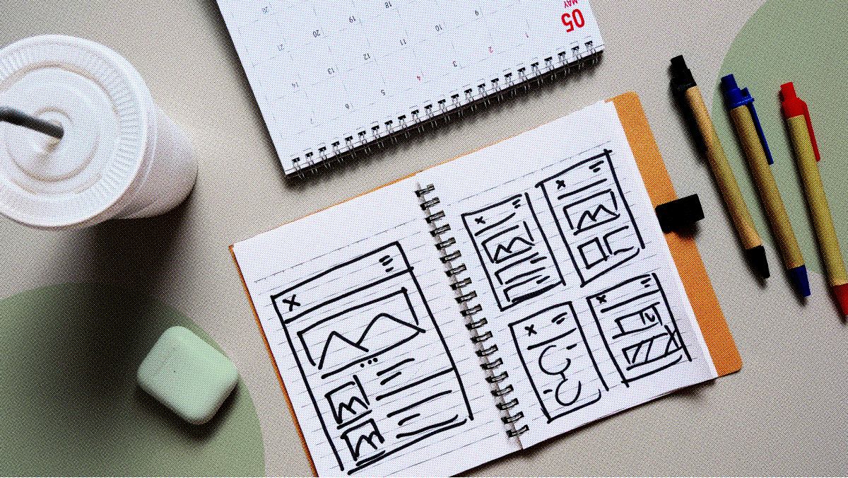
We all have that one app on our phones that crashes or doesn’t work right. Or a website that takes forever to load! Frustrating, isn’t it? It usually ends with uninstalling the app or leaving a bad review on the website (or, in extreme cases, smacking our phones till it responds). With over six billion people using smartphones today, mobile user experience (UX) has become more important than ever. Improving user experience on mobile includes considering user needs and wants to enhance layouts and navigations. Let’s find out more about it.
What is Mobile UX Design?

Mobile UX Design is the process of designing user experiences for hand-held, wearable, and mobile devices such as smartphones, tablets, watches, etc. Designers are responsible for creating solutions that meet the unique requirements of mobile users and optimizing their interactive experiences by aiming for efficiency, accessibility, and discoverability.
In short, it is the process of designing and developing a website or app with the mobile user in mind. This means creating a user interface (UI) and user experience (UX) that are optimized for smaller screens and touch-based input.
Why is Mobile UX Important To Businesses?
As we all know, the mobile user experience (UX) is becoming increasingly important. Many experts believe that it will soon surpass the desktop UX in importance. This makes sense when you think about it – after all, more and more people are using their phones as their primary devices for browsing the web, checking email, and making purchases.
As people spend more time on their mobile devices, it’s crucial for businesses to focus on mobile UX design. Only by improving the user experience on phones can companies keep customers engaged and increase conversions.
How’s Mobile UX different from Desktop?

Mobile UX is different from desktop UX in a few key ways:
- Mobile devices have smaller screens and require users to interact with them in a different way than they would with a desktop computer, so designers must be meticulous about how they use space on the screen.
- Additionally, mobile users are often on the go and may not have the same time to spend using an app as someone sitting at a desk. So the design needs to be easy to use and understand while people are moving around.
- Since mobile devices are often personal and always with the user, while desktop computers are usually shared among family or coworkers, mobile apps need to consider the user’s personal data and preferences to provide a more customized experience.
- Mobile devices typically have touchscreens, so designers need to consider how users will interact with elements on the screen using their fingers instead of a mouse or keyboard.
This means that designers must be aware of how users will use their app and tailor the experience accordingly.
Process of Designing UX for Mobiles
Most UX for mobile devices is designed using a process that consists of the following steps:
- Understanding the user’s needs and goals
- Identifying the key tasks that the user needs to be able to complete
- Creating a set of design principles to guide the design process
- Generating ideas for the mobile UX design
- Selecting and testing the most promising concepts
- Refining the chosen concept through iterations
- Launching the final product
Mobile UX Design Best Practices

1. Keep it Simple
When it comes to mobile UX design, less is definitely more. Keep your designs clean and clutter-free, and make sure that your UI elements are easily identifiable and intuitive to use.
2. Speed is Essential
Mobile users expect things to happen quickly, so it’s crucial to design an experience that is fast and responsive.
3. Make use of White Space
White space can be your best friend when designing for mobile devices. It can help create a sense of hierarchy and make your content more digestible for users.
4. Use Typography
Typography is another critical element of mobile UX design. Use font size and weight to create contrast and make information easy to scan.
5. Consider the Context
Mobile devices are often used on the go, so take into account the user’s environment and context when designing your UI. For example, larger buttons may be more appropriate for use in a car than on a bus.
6. Optimize for Touch
Since users will interact with your app or website via touch, optimizing your designs for this input method is essential. Make sure buttons and other elements are large enough to be easily tapped and consider using gestures as an alternative to traditional navigation methods.
Is designing Mobile UX necessary?
With the increasing popularity of smartphones, it’s more important than ever to ensure your Mobile UX Design is up to par. By following the above tips, you can ensure that your website or app provides an optimal user experience for your phone-using visitors.
Download ProApp and you’ll be well on your way to improving your mobile UX design!

